 |
 |
What I Did
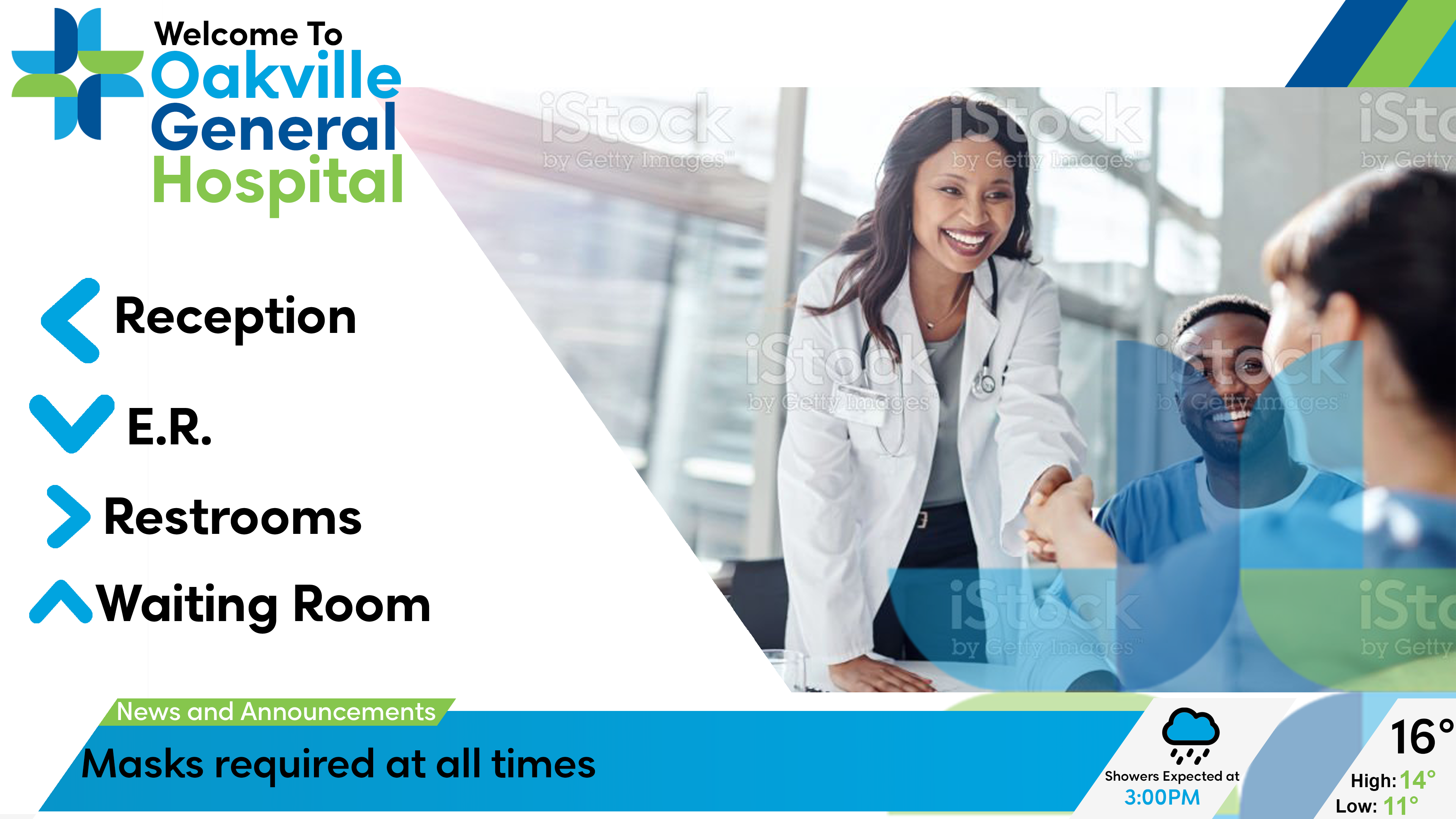
During a co-op at Omnivex, I was tasked with creating a series of graphics to showcase the use of digital screens in a healthcare environment. These mock ups show what would be seen on a digital screen in various areas of a hospital.
Design Decisions
Before starting the graphics I established the brand identity for the fictional hospital. By finding colours, angles and shapes that worked together I was able to create a cohesive series of designs that followed the same theme. I specifically used angled shapes to give a feeling of a sleek, modern environment with cutting edge technology. The blue and green colours are common in healthcare, and the use of white as one of the main colours provides a feeling of sterile cleanliness. The combination of all the colours, shapes, and fonts is meant to portray a sense professionality, which is exactly what you want to see when you go into a hospital.
Made in Photoshop.
What I Learned
This was my first time establishing a brand, and the experience of making the graphics taught me alot. Although its obvious, I learned that sticking to the exact angles and colours I chose for each graphic was crucial in making them all match. The process of creating the graphics in Photoshop was excellent practice for my technical skills, especially that early in my design career.


