Progress Images:
 |
 |
 |
 |
 |
What I Did
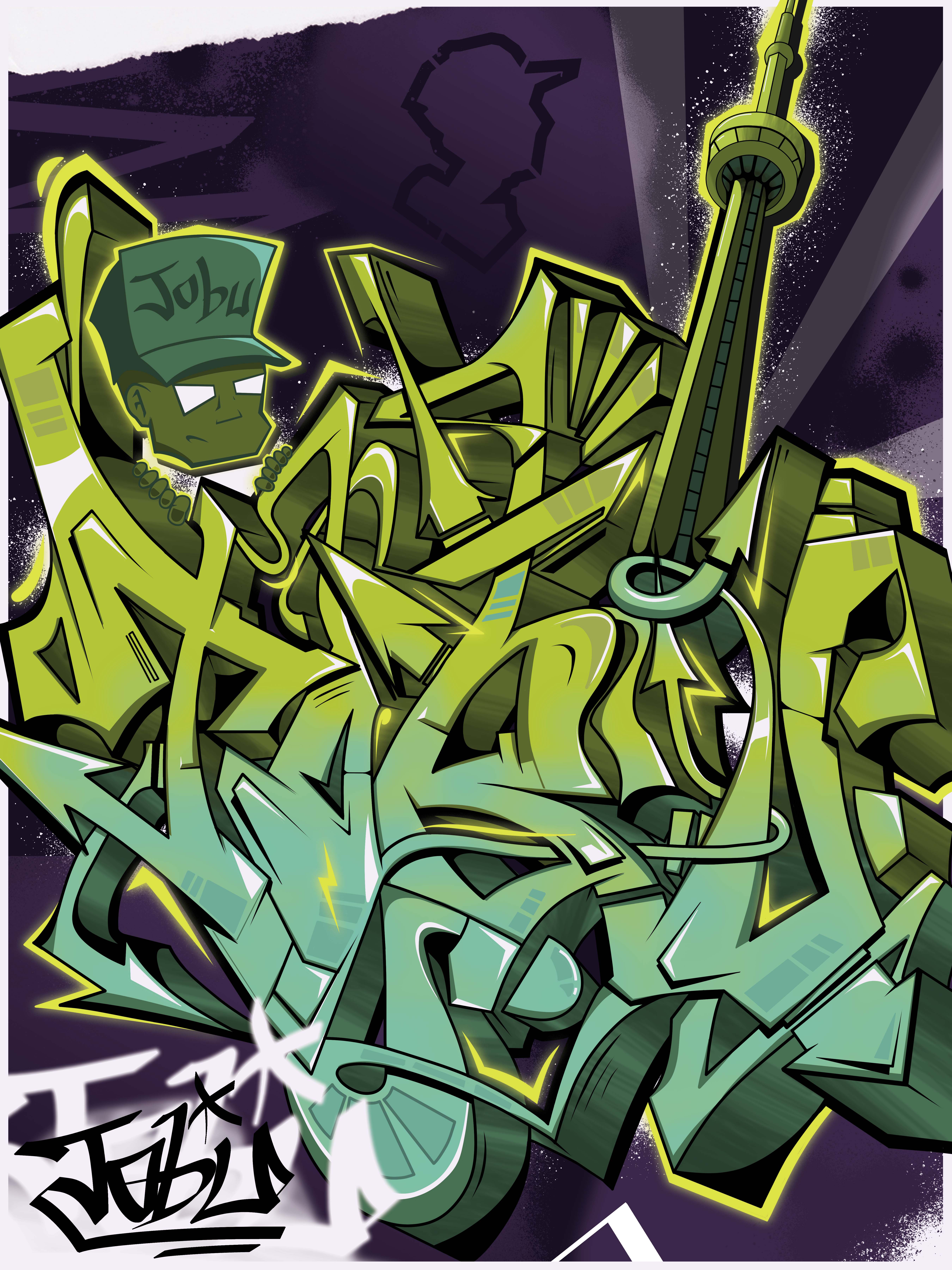
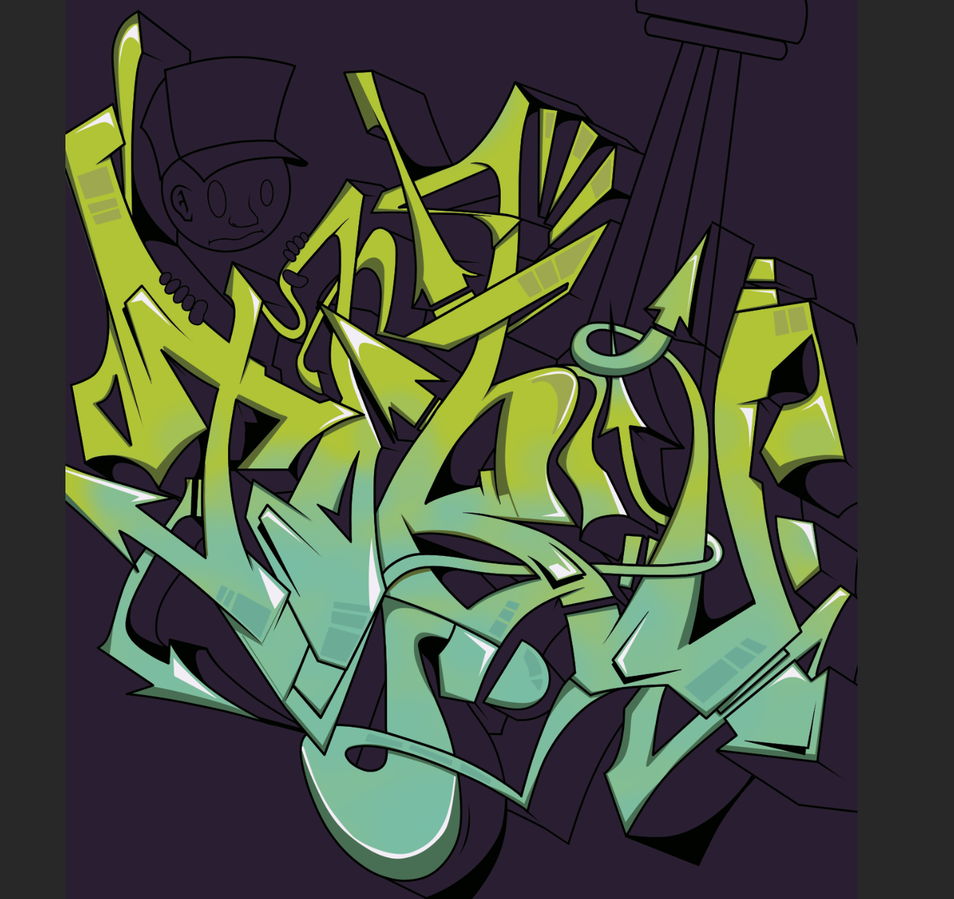
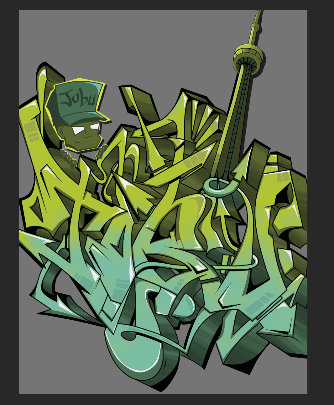
Over my winter term reading week, I spent several days creating a poster to strengthen my illustration skills. The poster contains original letter and character illustrations developed over several drafts.
The poster reads "JOBU", my alias.
Design Decisions
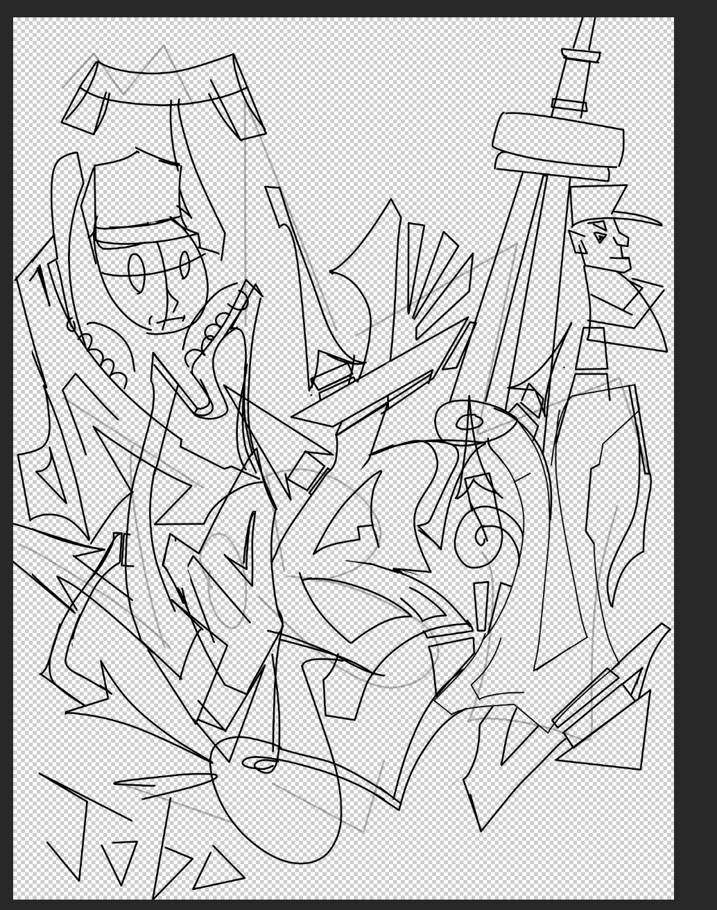
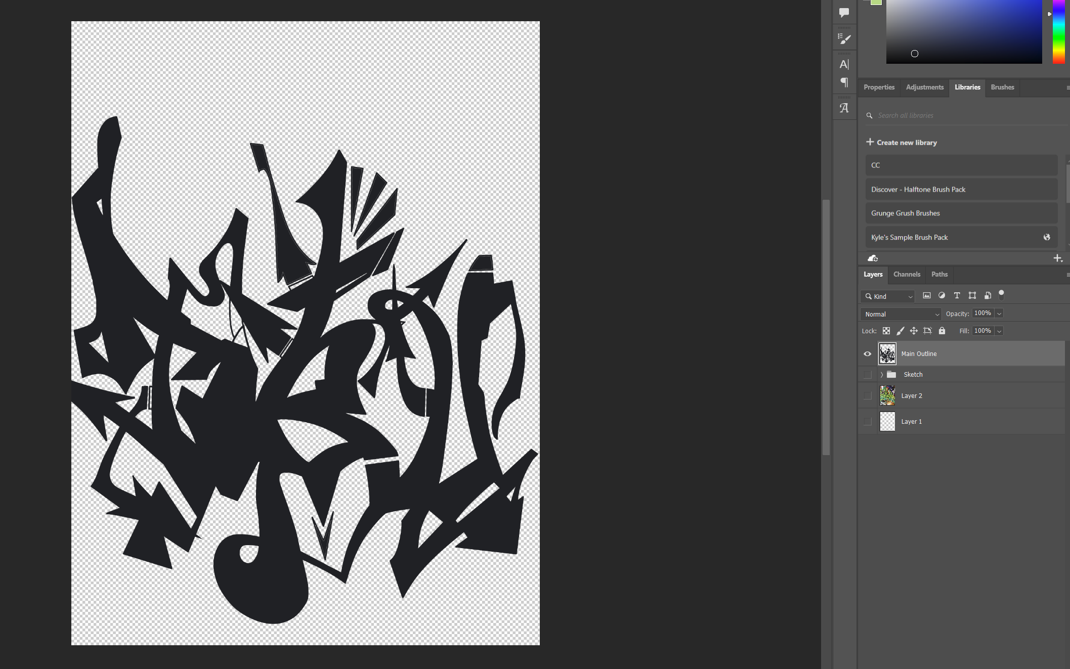
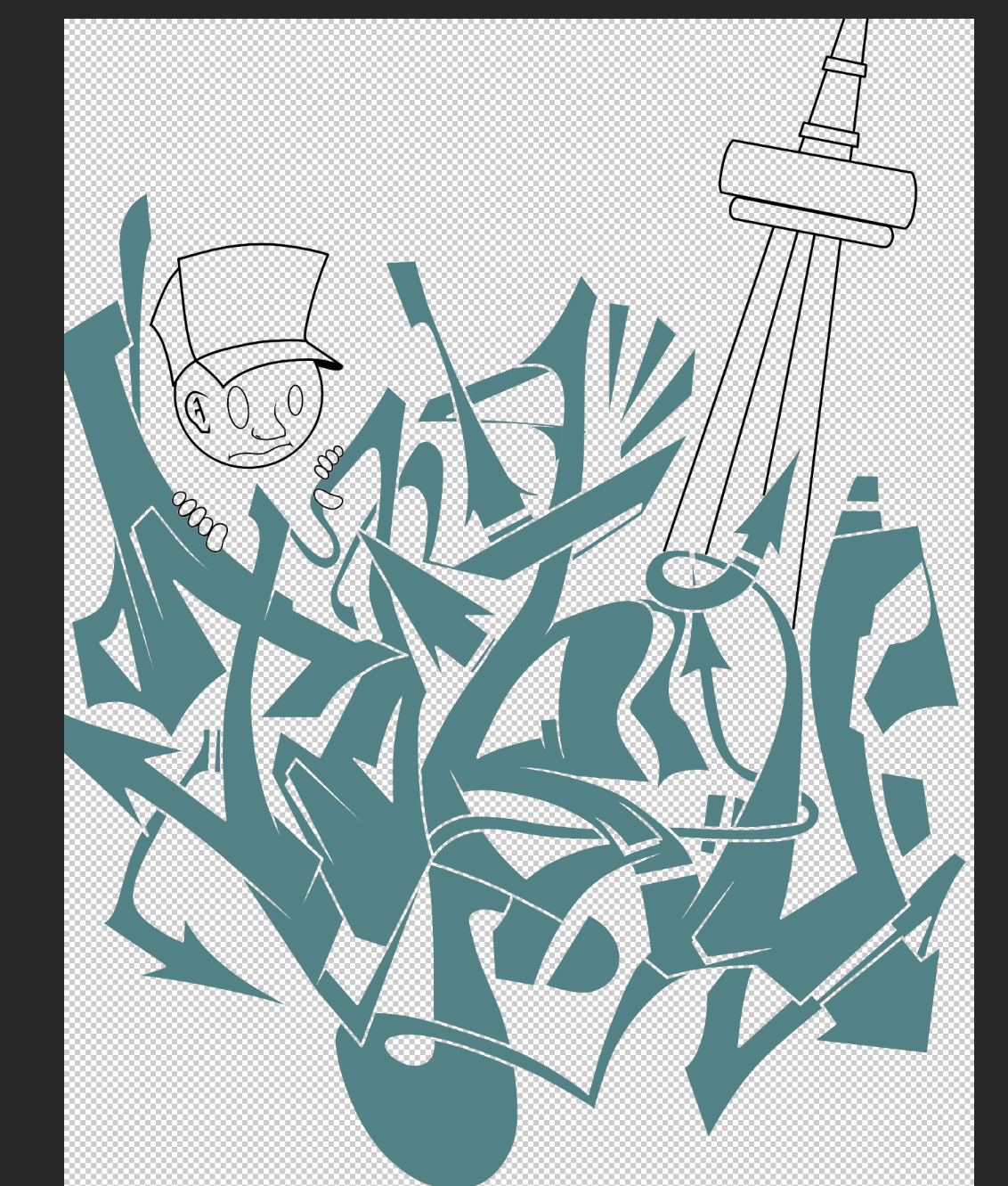
I made this poster with the intention of printing it out. With this in mind, I decided to start with a super rough sketch to understand the layout and structure of the poster. Before even considering colours I did a rough fill on the letters to better see the white space and ensure I was drawing attention to the right areas. Rather than using a uniform gradient to fill the letters, I drew it myself with a thick brush. This let me vary up the pattern and opacity of the gradient, making it more interesting to look at. Once all the main elements were done, I thickened some of the outlines. This was a crucial step that made each line unique, rather than having every single stroke the same length - which would be out of place in a chaotic design like this. The very last step was the background. I used purple, which brings your attention to the main design rather than the back. The illustration escapes the border in some sections to make it pop more and give a better sense of depth.
Made in Photoshop.
What I Learned
In the early stages of creation, I was struggling to get the letters to look how I wanted. The whole time I felt there was something off. after being stuck for a while, I added the 3d blocks to the letters. All of a sudden the poster started to look how I wanted. I had been focusing too much on the sketch of the letters, and not how I planned on bringing the sketch to life. I was expecting my letters to look good right away without all the extra elements I had planned. Ultimately I learned that focusing on the individual steps of a project without the end goal in mind was stopping me from achieving what I truly wanted.
Michael Gvozdek 2025