What I Did
For the final project of my GBDA 101 course, I created a short magazine showcasing my creative journey throughout the term. I had complete creative freedom with this project, so I decided to illustrate all of the graphics seen throughout the magazine. Everything seen on the magazines cover and spreads was made by me.
Design Decisions
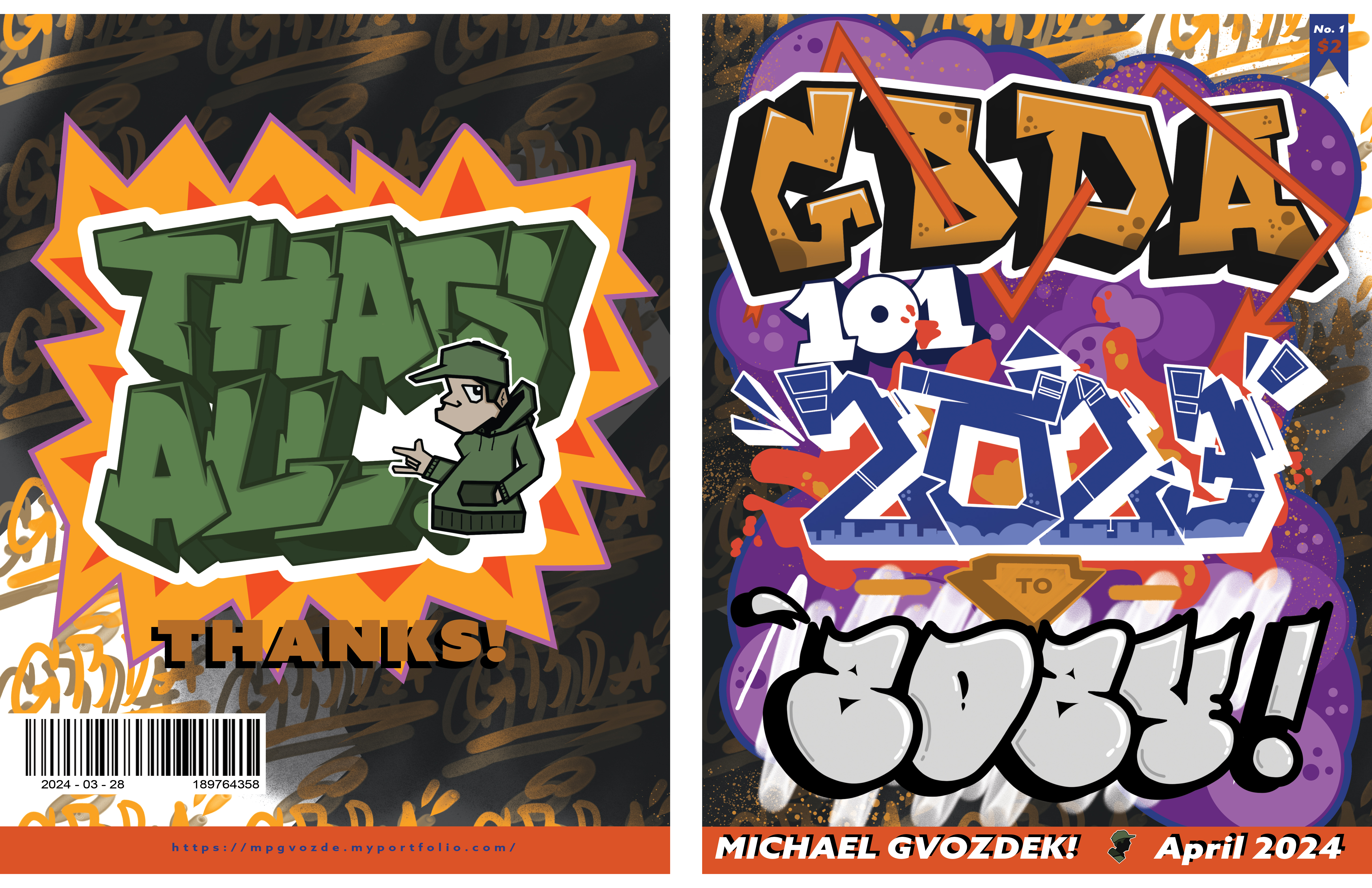
I wanted to go for a super vibrant and chaotic style for this magazine, and I achieved that in a number of ways. Creating a simple, yet still detailed background allowed me to make the subject of each page pop without having the background take away from the design. Illustrating the words themselves allowed me to carefully curate their aesthetics, which is part of what gives the cover page its recongizable style. I chose purple for the background of the cover because it contrasted each word the best while still being dark enough to not draw too much attention.
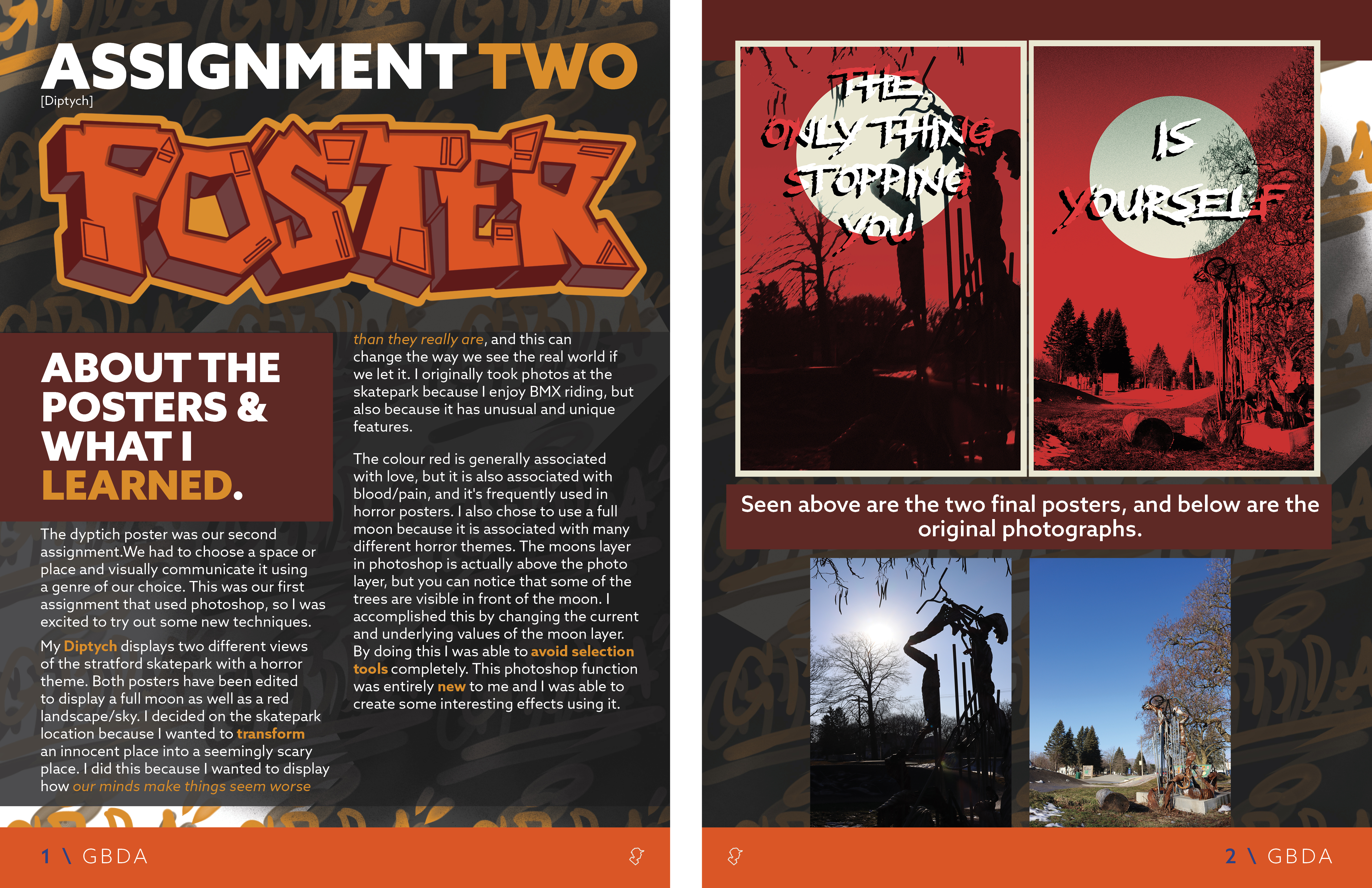
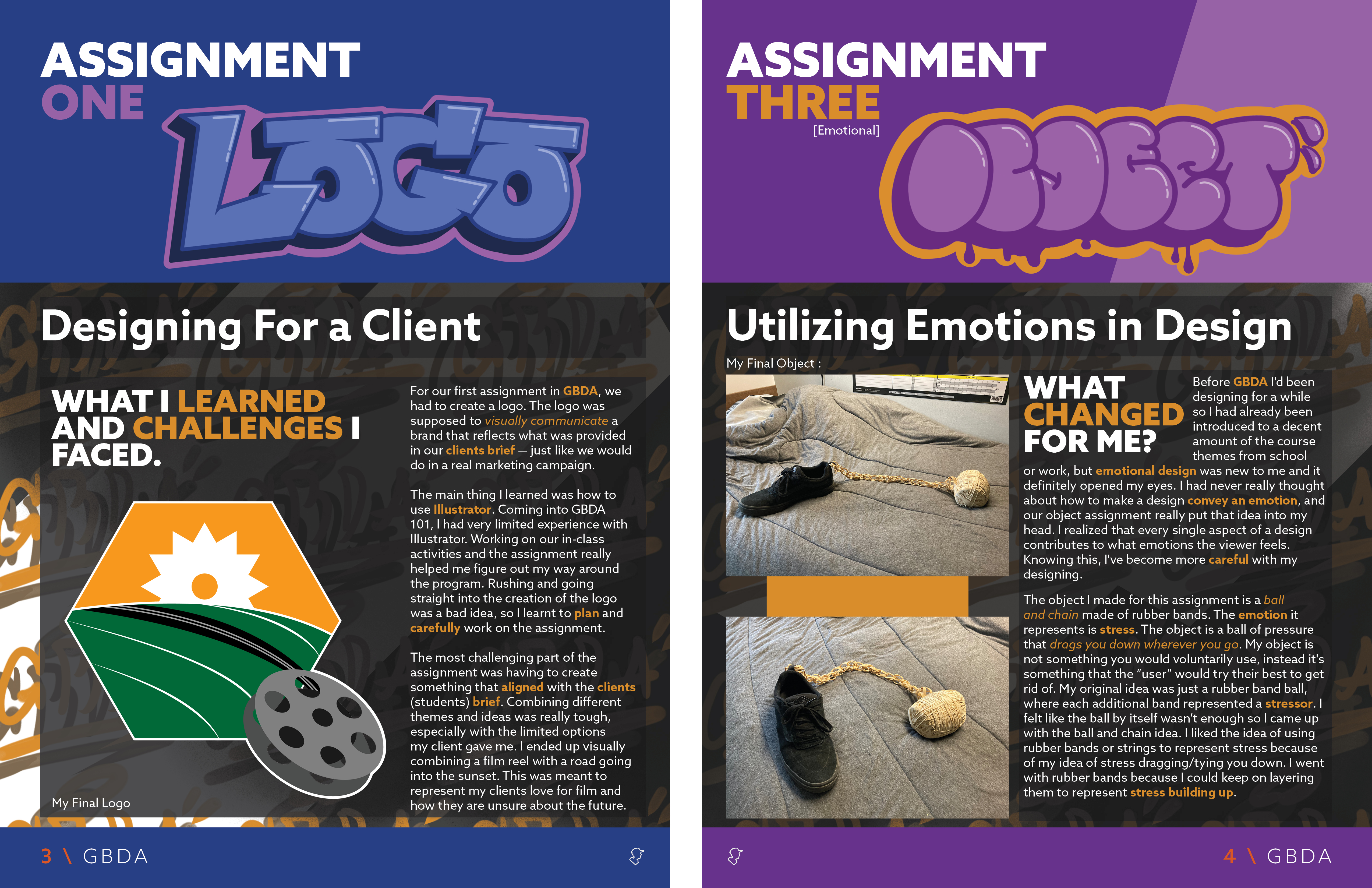
Each spread after that tones it down in the chaoticness, while still having an illustrated title that matches the theme. Keeping the body text as a regular font was crucial to keep the magazine readable, as well as for my sanity. I chose to bold important words throughout the entire magazine, I found that this was great for readability and it made the large paragraphs much less straining to see.
Made in Photoshop, Indesign, and Illustrator.
What I Learned
This was my first time making a magazine, and while i'm proud of how it turned out there are still many things I would change. Making the cover and spread titles was great practice for illustration, but looking back I could have embraced that style even more for each page. The spread pages have a pretty large contrast between them and the cover in terms of style, and that can be a little jarring. There are also a few spacing errors I would fix, as well as some errors in the layout of the text columns.
Michael Gvozdek 2025